
Design
I love design; I spend most of my time doing it. I greatly enjoy learning new methods, keyboard shortcuts, etc. that help me be a stronger and faster designer. I've taken additional graphic design classes that have greatly helped me in creating better yearbook and broadcast designs.
I start with a sketch of what I want, then lay the main elements I want down. From there, it is a lot of tweaking, taking a step back, checking for readability, etc. to make sure a design is at the best it can be.

Always Something New
Co-Editor in Chief | 2024-2025 | InDesign, Photoshop


Graduation
The graduation spread is the first spread of the book, and sets the rules for everything else. Here, I designed the folio, figured out how the pull quote and partial cutouts would work, spacing, pull colors, etc.


2024 Election
Around the election, I went to our local church (New Life Church, sign pictured) that holds voting and took pictures of all of the signs outside it. The editors and I collected newspaper clippings and stickers. I photographed and cut out everything, then worked on collaging it all together in a way that would highlight both sides, and still allow for content. I had to be very particular with the "vote here" signs, and made sure they were all pointing inside the spread and towards the NLC sign. I'm incredibly proud of how it turned out.
I contacted the Student Press Law Center to check for fair use for the stickers and newspaper clippings. We came to the conclusion that I was in the safe zone, and it fell under fair use.

Required Reading
Sometimes, the editors and I have to take over spreads that have no content: this was one of those. I photographed and created most of it during two hours on a deadline night, with the stories coming a little later. I went with my advisers to the library to "borrow" books to take pictures of, and figured out how I could still meaningful tell a story without too much work, as there was little time until submission. I ended up with this, which I am incredibly happy with. I love the big bold type and all of the colors.

THEME PACKAGE
Football Championship
I'm a paragraph. Click here to add your own text and edit me. It's easy.

Football Championship
The editors and I agreed we wanted this spread to be more than "normal;" we wanted it to really stand out. I brought in the gradients from the theme pages, got permission to get the trophy out of the case to photograph it and cut out several photos. The most challenging part was figuring out where to place captions and how to keep them readable. Originally, the left gradient stop in the middle of the captions. However, that was difficult to read, so I made it bleed of the page to prioritize that readability.
Index
Index is easily one of the most challenging thing to design; we want to both highlight the new things from throughout the year and work around the names. Some letter sections are incredibly long, some barely make it to the next page. It took a lot of trial and error to get everything to fix where it is now.
Application is no longer available.
Make Your Mark
Co-Editor in Chief | 2025-2026 | InDesign, Photoshop, Procreate

Graduation
Again, graduation set the rules for the rest of the books. We decided to keep the script font to theme pages, folios and breakers to avoid overuse.
The folios and pull quote reflect the end sheets, and we continue with the framing box on the dominant photo.

Halloweekend
This spread was a challenge: there was so much to cover and so many good photos, yet so little space. I picked the dominant photo for the emotion and the overlapping photos because they displayed things that were special to Senior Night and had good stories. Then, the bottom of the spread was a matter of fitting these good stories in the smaller space, and I think it turned out good.

Football Championship
While I love the championship breaker from the year prior, I wanted to avoid copying it. So, to match the story covering more groups, I put four non-football pictures in the main "collage." Then I made photos bigger and brought in the partial cutouts and colored drop shadows.

Class Officers
I wanted this spread to be more than just big cutouts of the officers. So, while I was sketching out a design for this on my iPad, I used stock photos as inspiration and loved the way an overhead one looked. I took that as my inspiration for the photo shoot, then had fun playing with the partial cutout and big type.

Competitions
State and National Convention Submissions | InDesign, Adobe Illustrator

ASPA Theme Development
I love the challenge provided by on-sites. An hour and a half and provided photos/theme, and all I need to think about is design.
I chose a blocky sans font and squeeze "RIGHT" in between the three color columns to give the idea that the word itself was in the perfect place. I wrapped the columns onto the back cover because I feel back covers always need something.
I brought back the lines in the end sheet, and again gave them just that little, perfect amount of space between other items.
On the divider, I brought in a partial cutout because I feel they always add so much, and continued with the single word between boxes. This design ended up placing first.


JEA/NSPA Cover/Endsheets
This was my third time competing in this contest, and I ended up placing Superior. "IYKYK" is a very modern, online and trendy phrase, and I wanted the style to reflect that. I chose black and white and with color pops because that is very trendy. The repeated "IYKYK" gives a grid vibe that is common in social media, and the letters popping out across the rows gives the viewer a path to look at. The back more solidly introduces grids, as well as resembling a Wordle.
I continued with the grid square on the end sheet, with the popping cutouts reflecting the letters popping out on the cover. I added the "AND WE KNOW" to provide more to the theme before getting to the theme copy; I thought it was very clever.


Broadcast Graphics
Hornet Media News and Sports Productions | 2024-2026 | Adobe Illustrator, Photoshop, NewBlue Titler

Thumbnails
After our first few livestreams, I volunteered to create thumbnails so they would be more than just a stretched image of our logo.
I've kept with diagonal lines and blues to build a strong, recognizable image. Thumbnails are one of the most important part of a video because it draws people in.
I use my own photos, and try to use a variety of players because I know they and their families look at and care about the thumbnails.
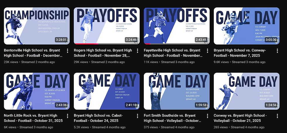


Football Livestreams
This year, I improved our score bugs beyond the templates we used before to give Bryant a more unique image and introduced a title screen for the start of live streams. I built it all in NewBlue Titler so it is easier to change game to game.


Basketball Livestreams
Like football, I made a new score bug and title screen graphic for basketball. I also made starting lineup, free throw and half time graphics to enhance the overall stream.


Shows
I studied other news and sports shows as inspiration for these graphics, continuing with the use of blues and diagonal lines I've done for thumbnails. This establishes a stronger identity for our sports show, separate from our news' productions.


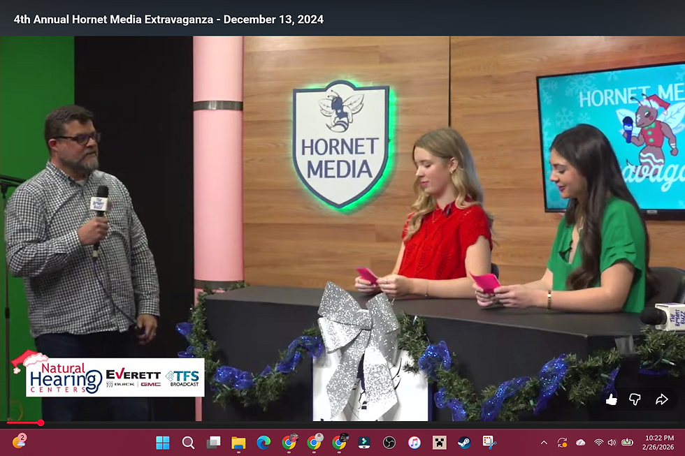
Hornet Media Extravagazna
The Hornet Media Extravaganza is an annual, six-hour live stream. I designed thumbnails and sponsor graphics for the 2024 and 2025 streams to have a special broadcast and season specific hornet, as well as wintery and visually-appealing fonts and backgrounds. Again, this establishes a more solid identity for the Hornet Media Extravaganza that people will remember and recognize.


T-Shirts and Stickers
Adobe Illustrator & Procreate
T-Shirts
Since 9th grade, I've designed t-shirts that is paid for from the publications' extra money, so that each staff member can have one. I also make sweatshirts, but that is optional and bought by staffers. This is something for everyone to wear at conventions, distribution days and everyday, too.
I use the publication's fonts and colors from that year. The front says the publication and the year, while the back displays the names of the whole staff. We commonly wear our shirts from the year before, and they serve as a nice tangible memory of the book we all worked so hard to create and the staff that we bonded with.


Stickers
In graphic design, one of our assignments was to create a sticker sheet. I decided to create one inspired by the 2026 book colors and objects (and animals) significant to our staff, like 7 Brew, energy drinks, fidgets, etc.


Concluding Thoughts
In my five years of using Adobe platforms, I've worked hard to learn all of the technical and design skills I can. I watch videos online about design in my free time and attend design workshops at conventions. I've learned how to go through the design process, create designs to be used for an entire book or broadcast staff, think each little thing through, explore to find the best look, etc.
Recognitions: 2025 ASPA Yearbook Designer of the Year, ASPA: Superior and Best of ASPA in Literary Magazine Cover Design, Excellent in Literary Magazine Thematic Development , Superior and Best of ASPA in Literary Magazine Design, Excellent in Academic Layout, First Place in Theme Development Computer Based, Superior in Alternate Coverage First Place in Theme Development Computer-Based, Superior in Cover Design, Superior and Best of ASPA in Special Coverage, Superior and Best of ASPA in Theme Development, Superior and Best of ASPA in Academic Layout, JEA: Excellent in Newspaper Single Inside Page Layout Design, Excellent in Yearbook Cover/End sheets, Honorable Mention in Yearbook Cover/End sheets, Superior in Yearbook Cover/End sheets
